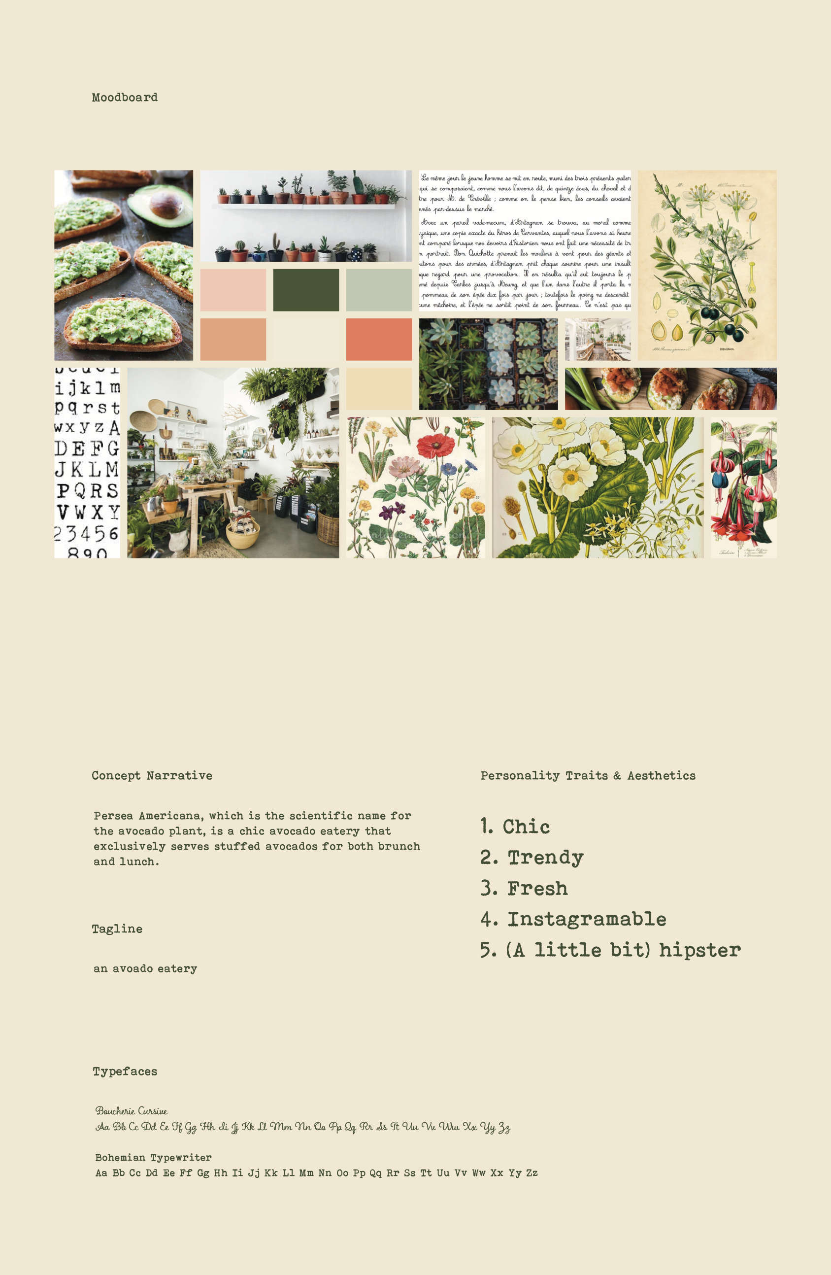
For the moodboard and design, I was inspired by vintage botanical drawings, Earth-tones (especially avocado green!), succulents, French school script, and the texture and slight variation of typewriter letters.
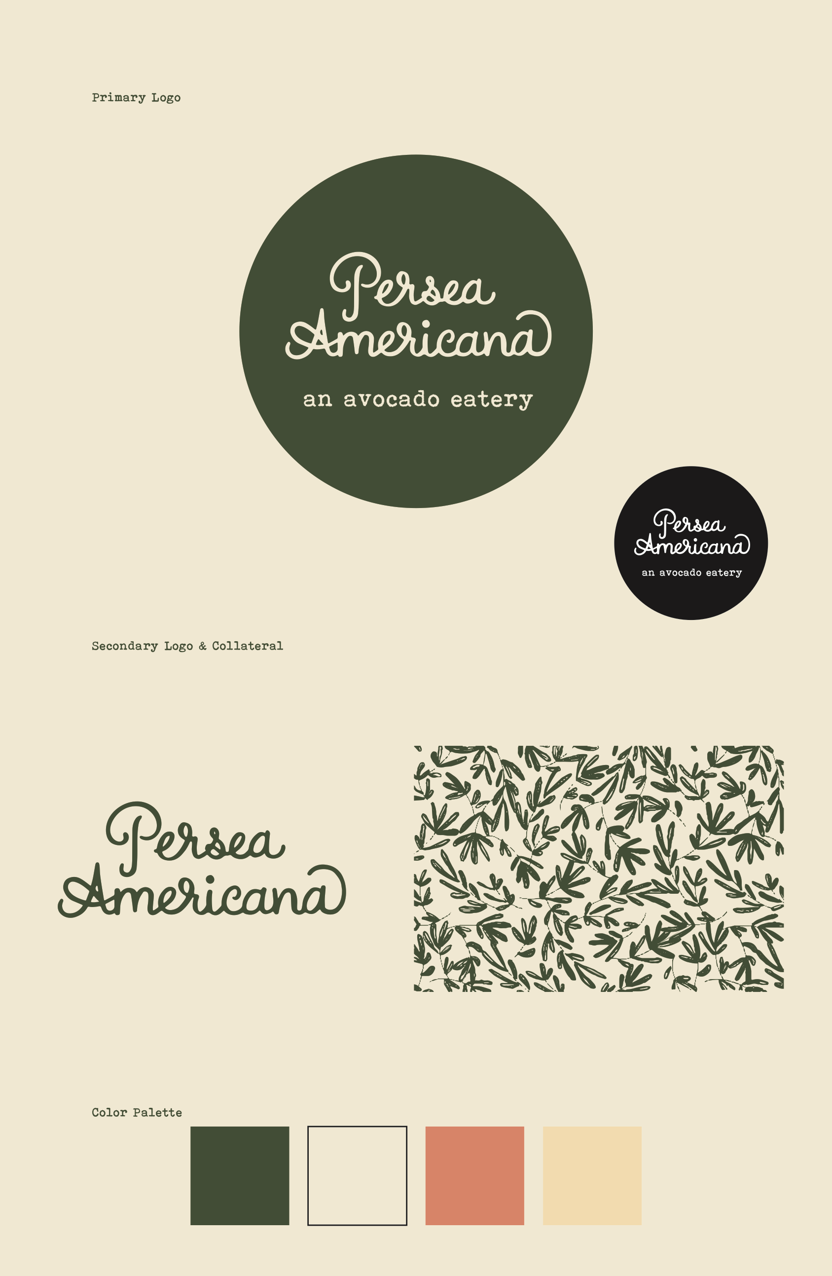
The first element I designed was the logo, which I hand-lettered. The name of the restaurant, Persea Americana, comes from the scientific name for the avocado plant.
Next up was the menu, which features a hand-drawn leaf pattern. Menu items include stuffed avocados for both brunch and lunch, and the option to chose various combinations of the menu items: the avocaDOS (2 halves), the avocaTRES (3 halves), and the avoQUATRO (4 halves).
I then created a single-page magazine ad to be featured in Texas Monthly.

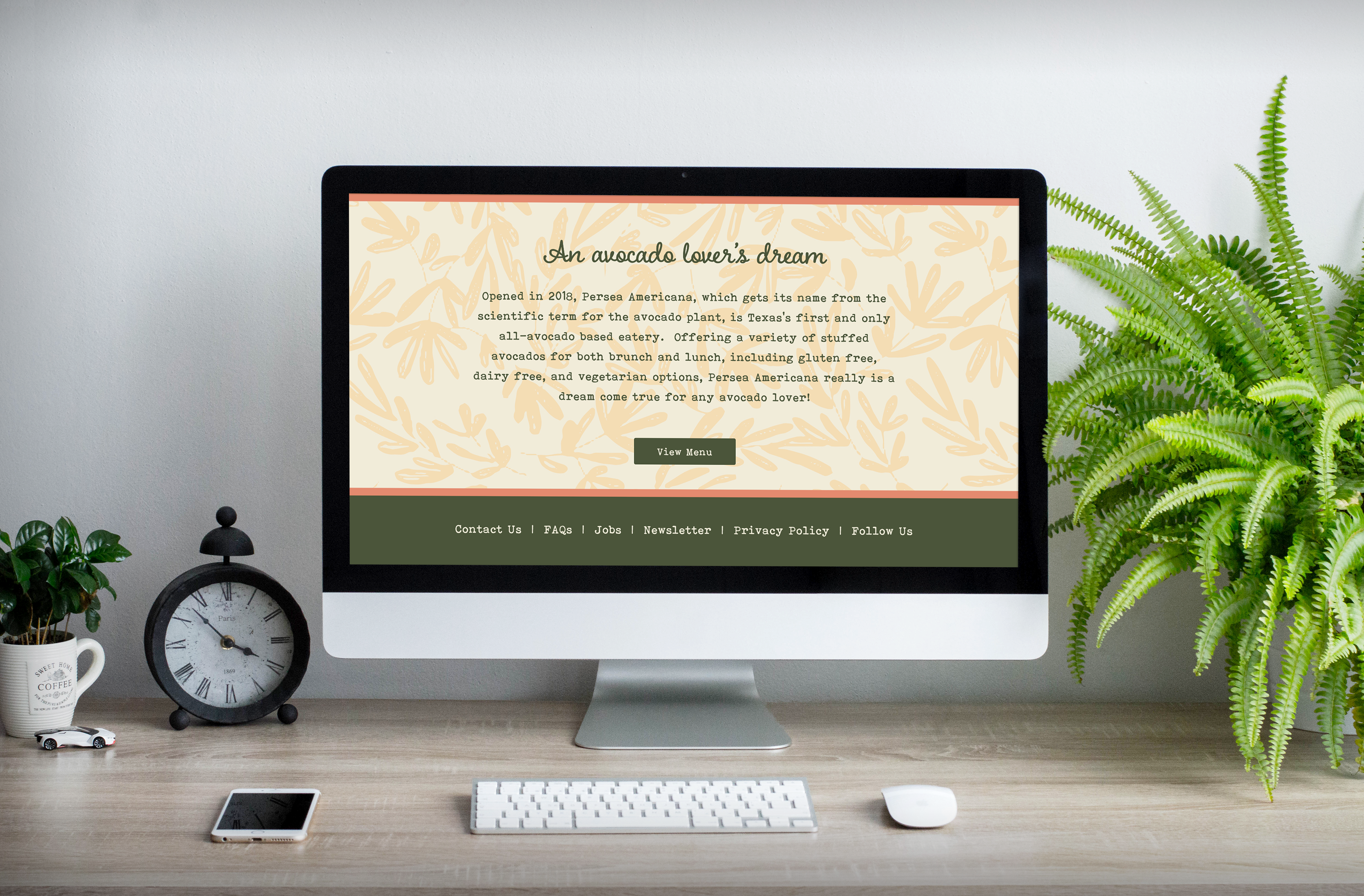
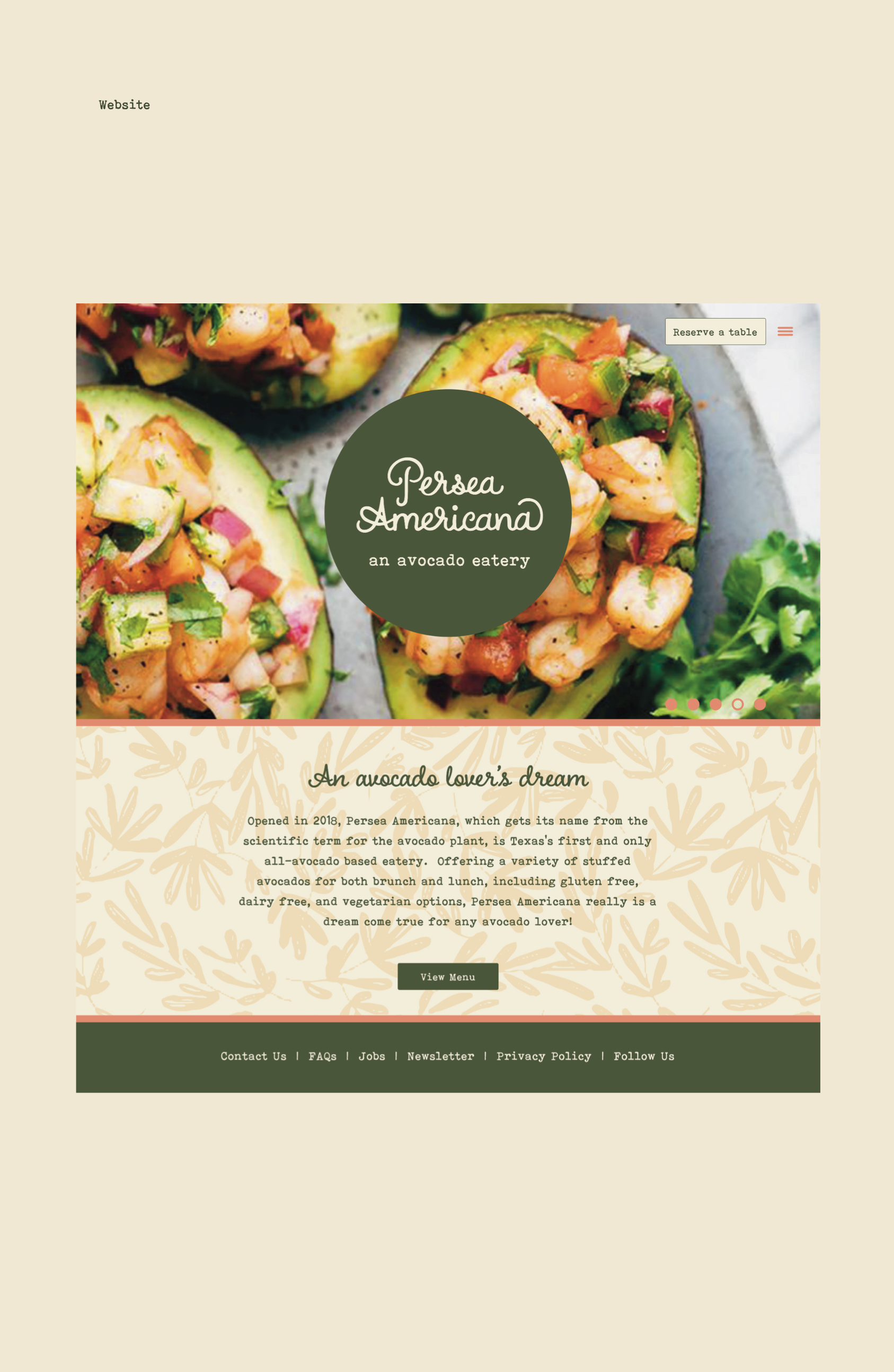
website home page

website about page
Finally, I created a website mockup that featured a home, menu, and about page for both web and mobile.


The final brand guide for the restaurant!